Building a brand from the first idea to the final product.
Project
Starter Plan
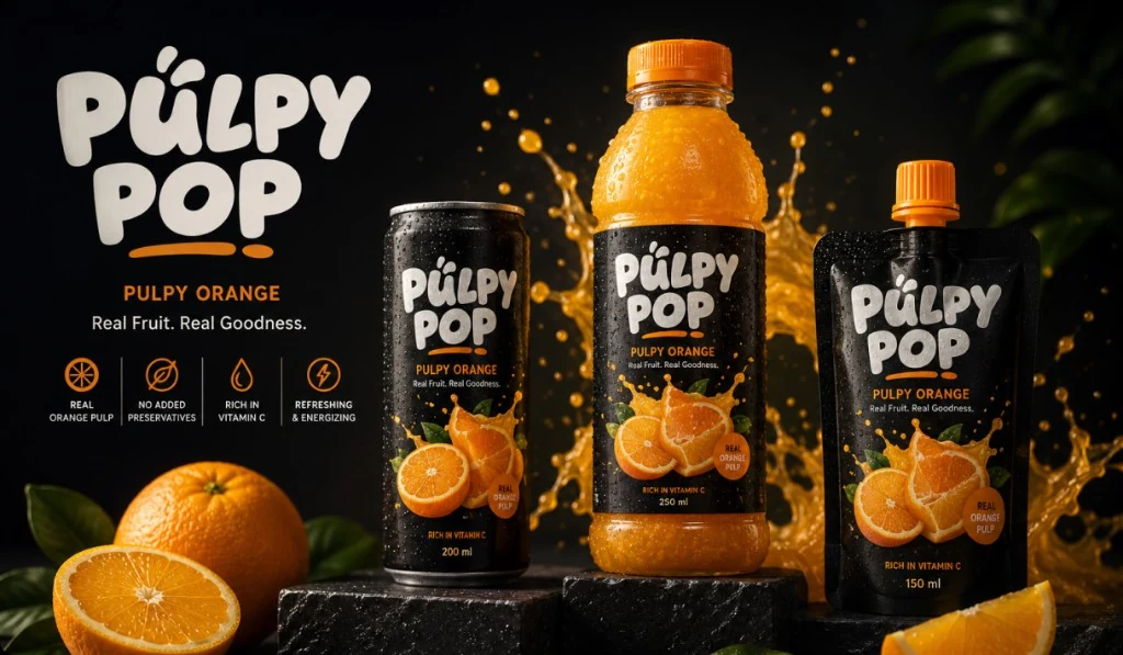
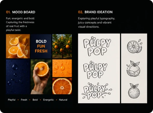
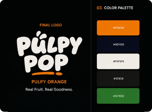
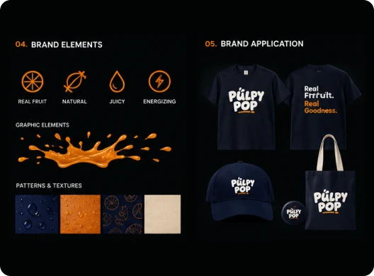
Pulpy Pop needed a brand that tastes as fresh as it looks: fun, energetic and bold, with real fruit at its heart. We began with a mood board that captured the freshness of oranges with a playful twist, then explored hand-drawn typography and juicy illustration ideas before refining the final logo and colour palette. The identity was then extended into icons, graphic elements and textures, and tested on merchandise to make sure it works wherever the brand appears.
Project
Overview
Pulpy Pop is an orange juice made with real orange pulp, no added preservatives and plenty of vitamin C. Brand Bytes built the brand from the ground up, covering brand strategy, logo design, visual identity, packaging design and label design.
A rounded, hand-crafted wordmark with a juicy orange underline gives the brand its playful personality, while a deep navy and black base lets the bright orange pop. Simple icons highlight what matters most to customers: real fruit, natural ingredients, juiciness and energy.
The identity comes together across a can, bottle and pouch range and carries naturally onto merchandise, giving Pulpy Pop a fresh, consistent presence on the shelf and beyond.